MA Visual Game & Media Production - Royal Danish Academy 1. Semester Project
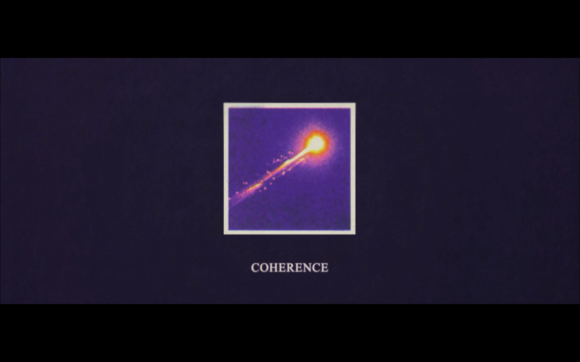
I chose to make a title sequence for the film Coherence(2013). The film is about strange things happening while a meteor passes by, and the rules for quantum physics do not apply anymore, so different outcomes of events coexist.


Problem Statement
How can I create a title sequence that complements the story world in Coherence mixing digital and analogue media?
Inspiration

There is a physics book in the film that has a significant role to the plot, my goal is to create an illusion that you are flipping through that physics book in the title sequence.
Visual Identity

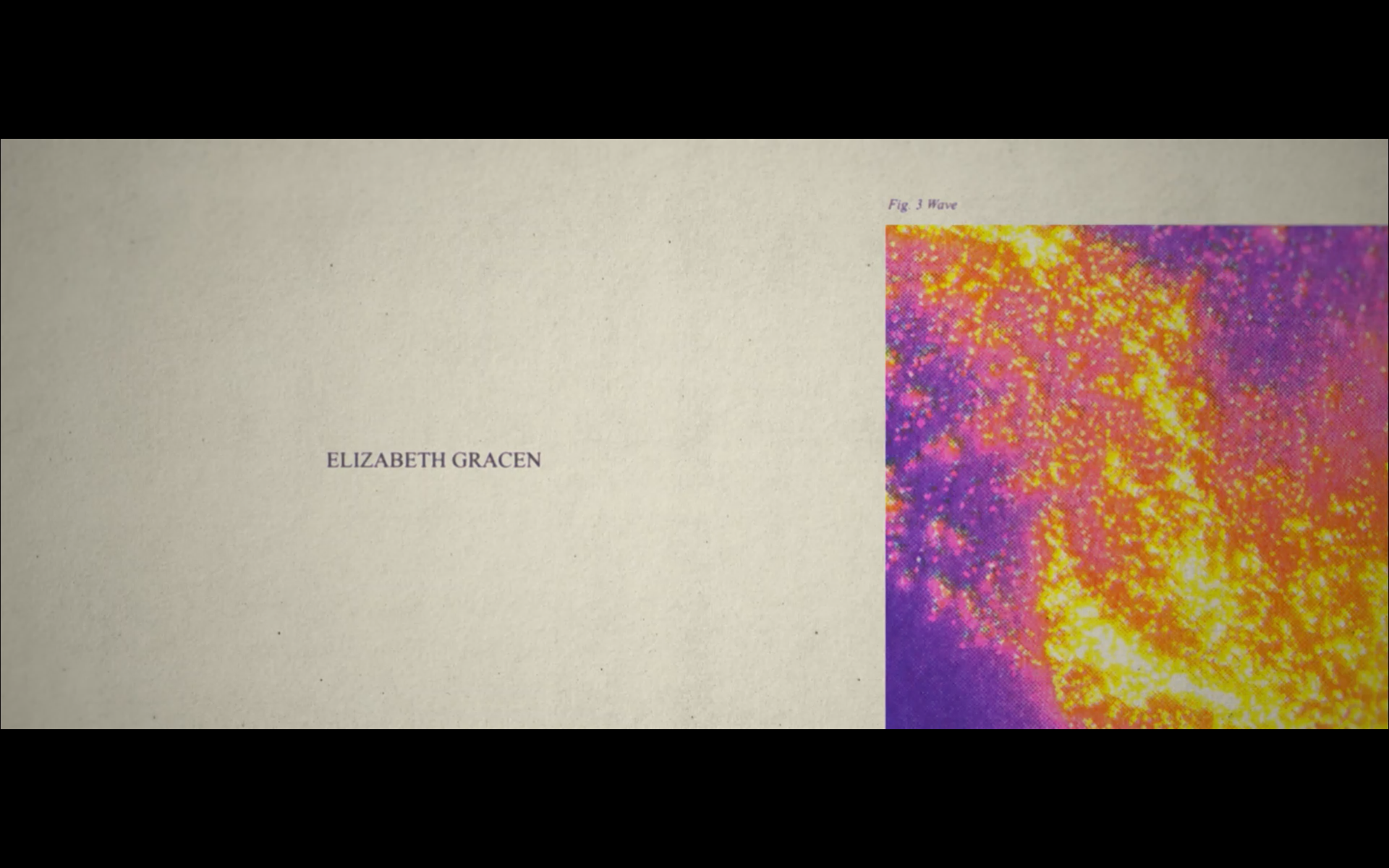
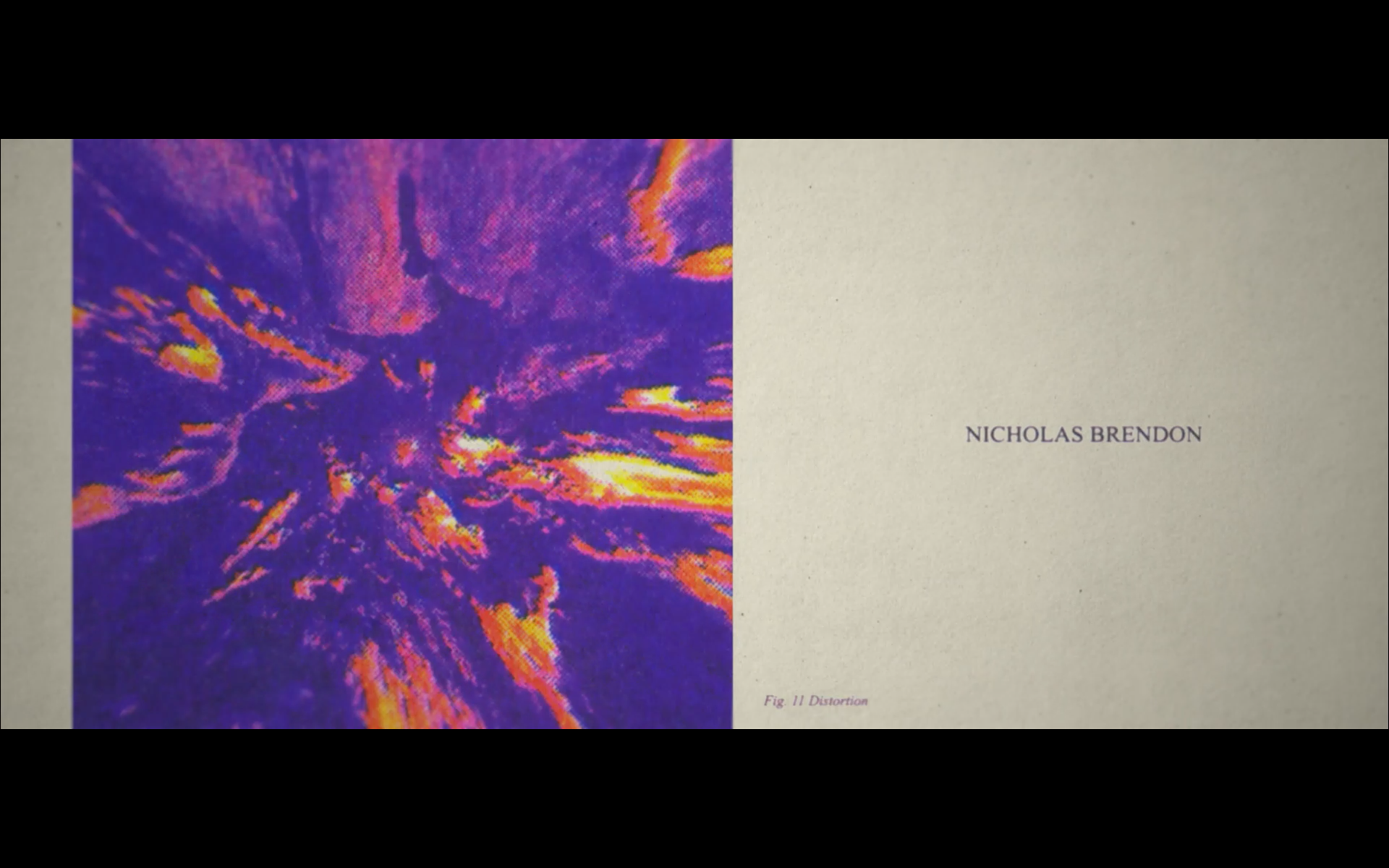
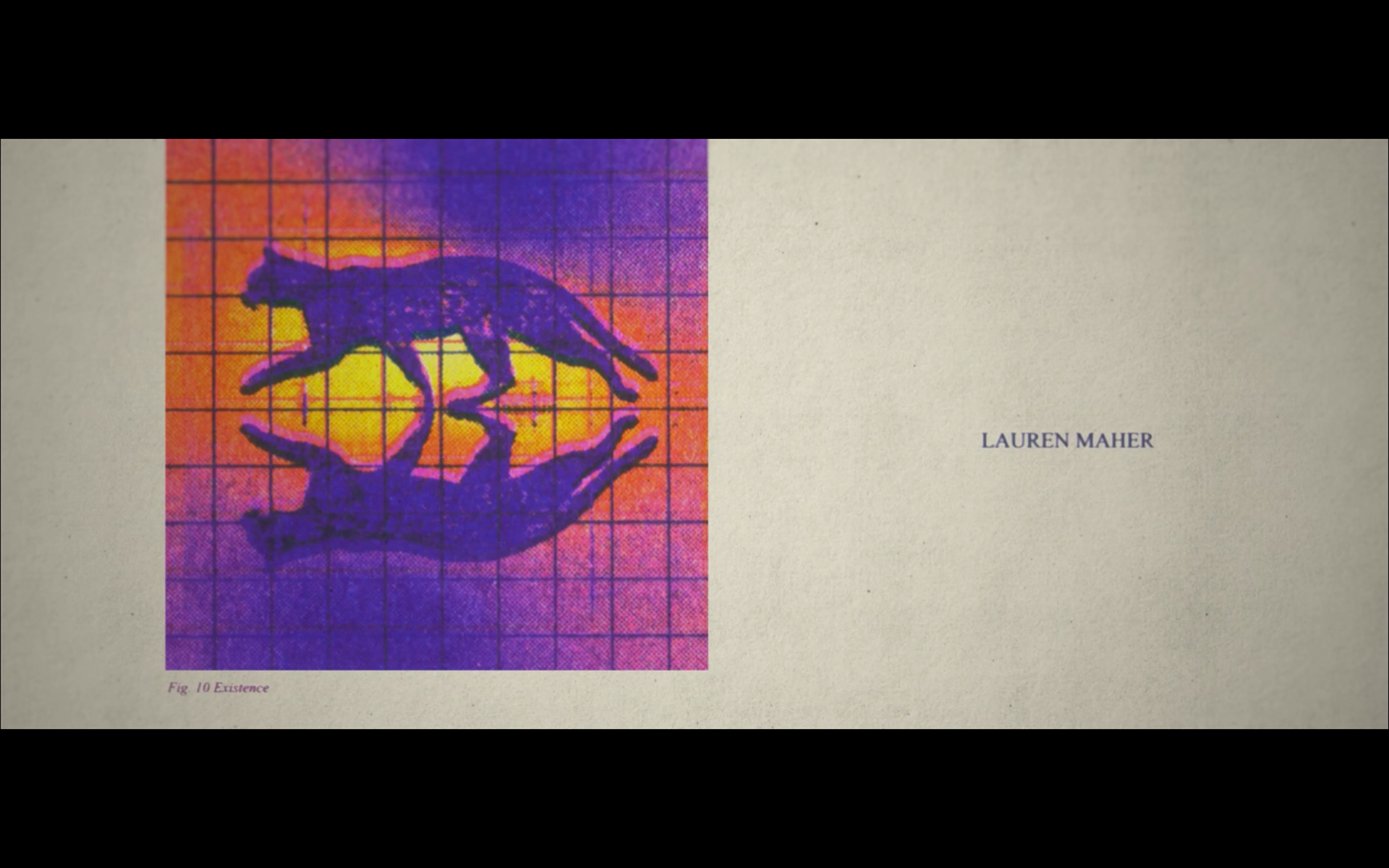
I used Times New Roman as is it one of the most used fonts for textbooks. The color scheme was inspired by the Hydrogen Wave Function illustration. I blended the riso colors Blue, Yellow and Fluorescent Pink to match the colors in my color scheme.
Risograph
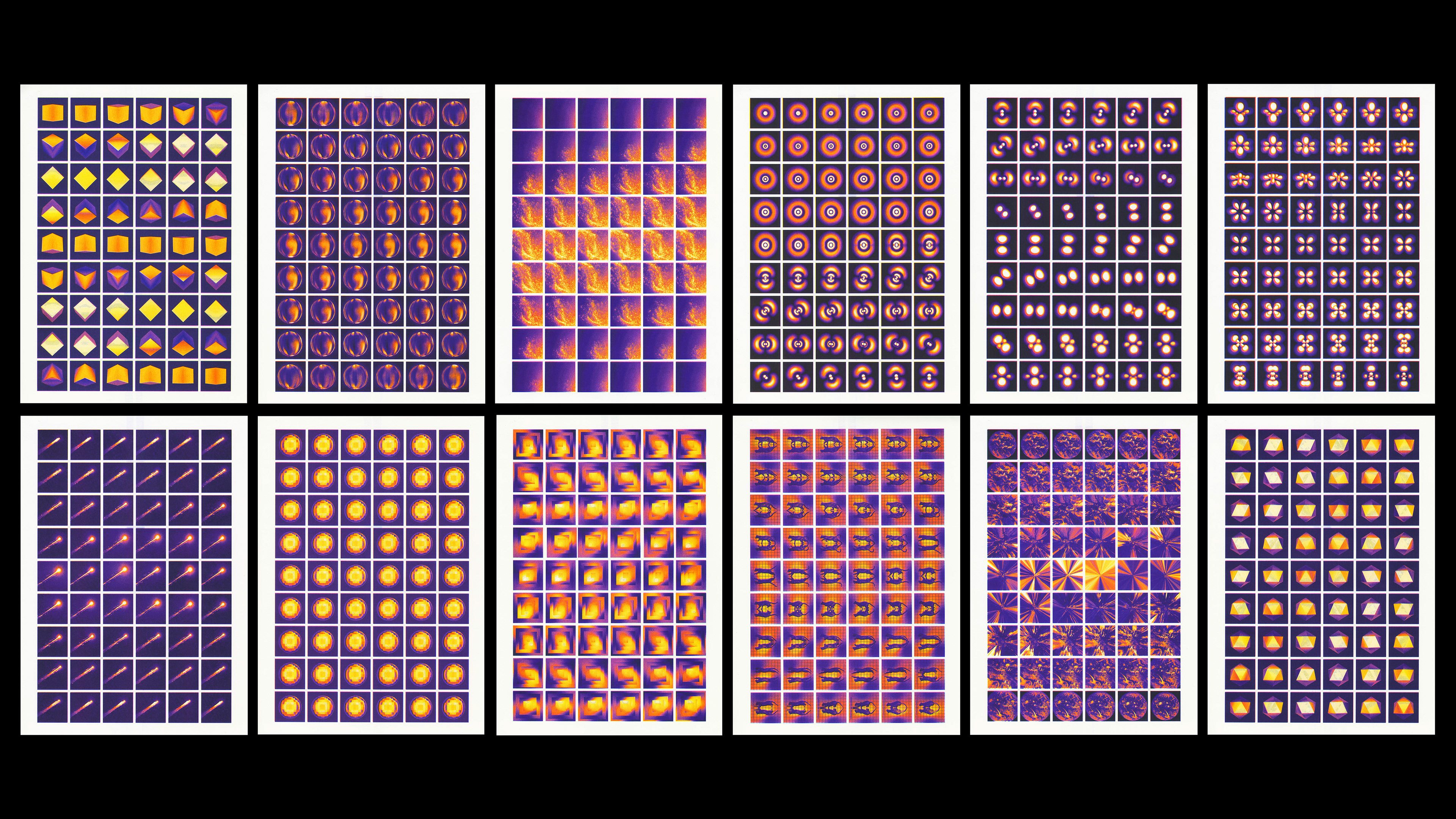
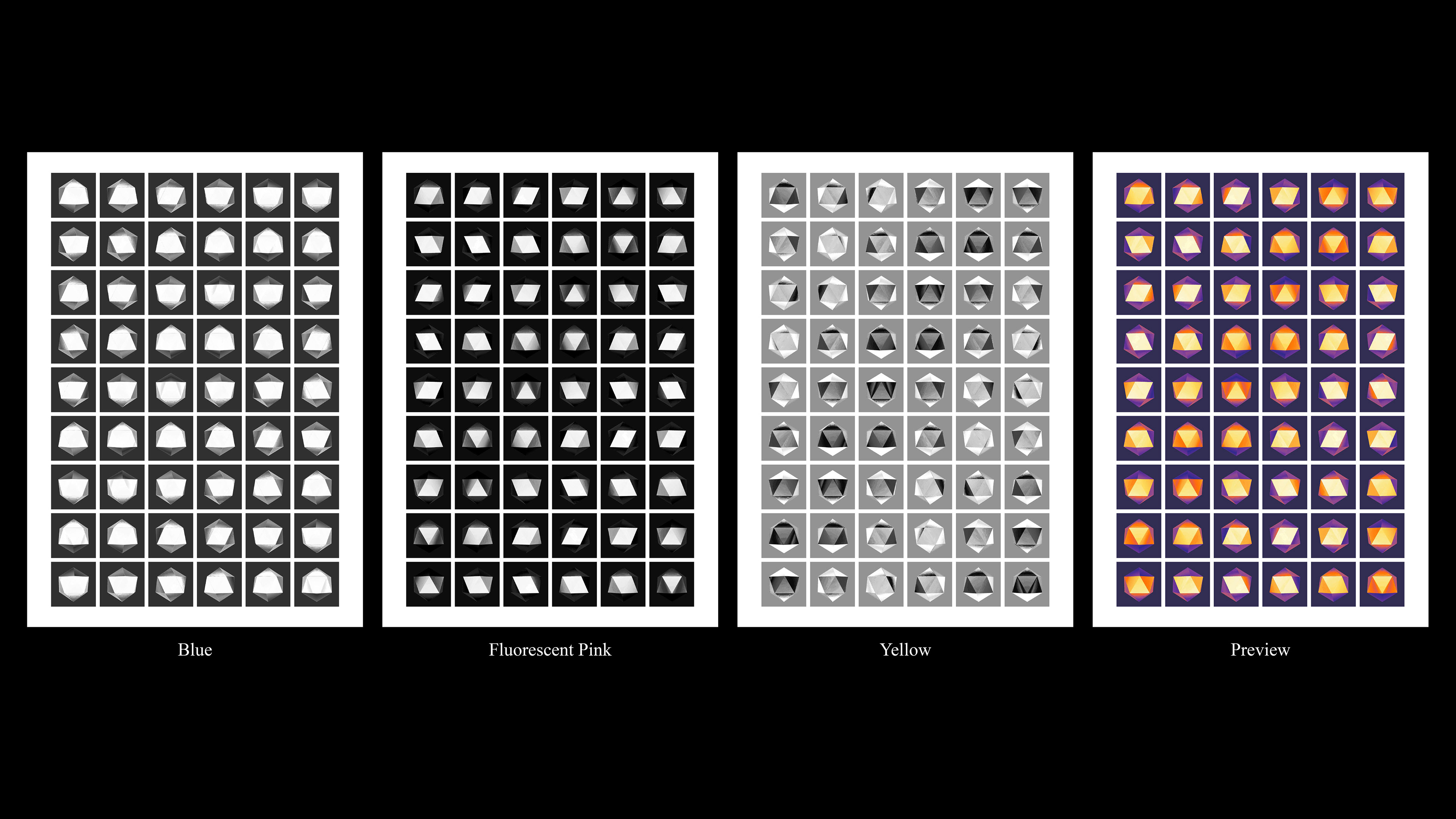
To achieve the analogue look I risoprinted the frames and scanned the afterwards. It ended with 12 different riso print design all with 3 colors and with 54 Frames so in total 648 frames.
Figures

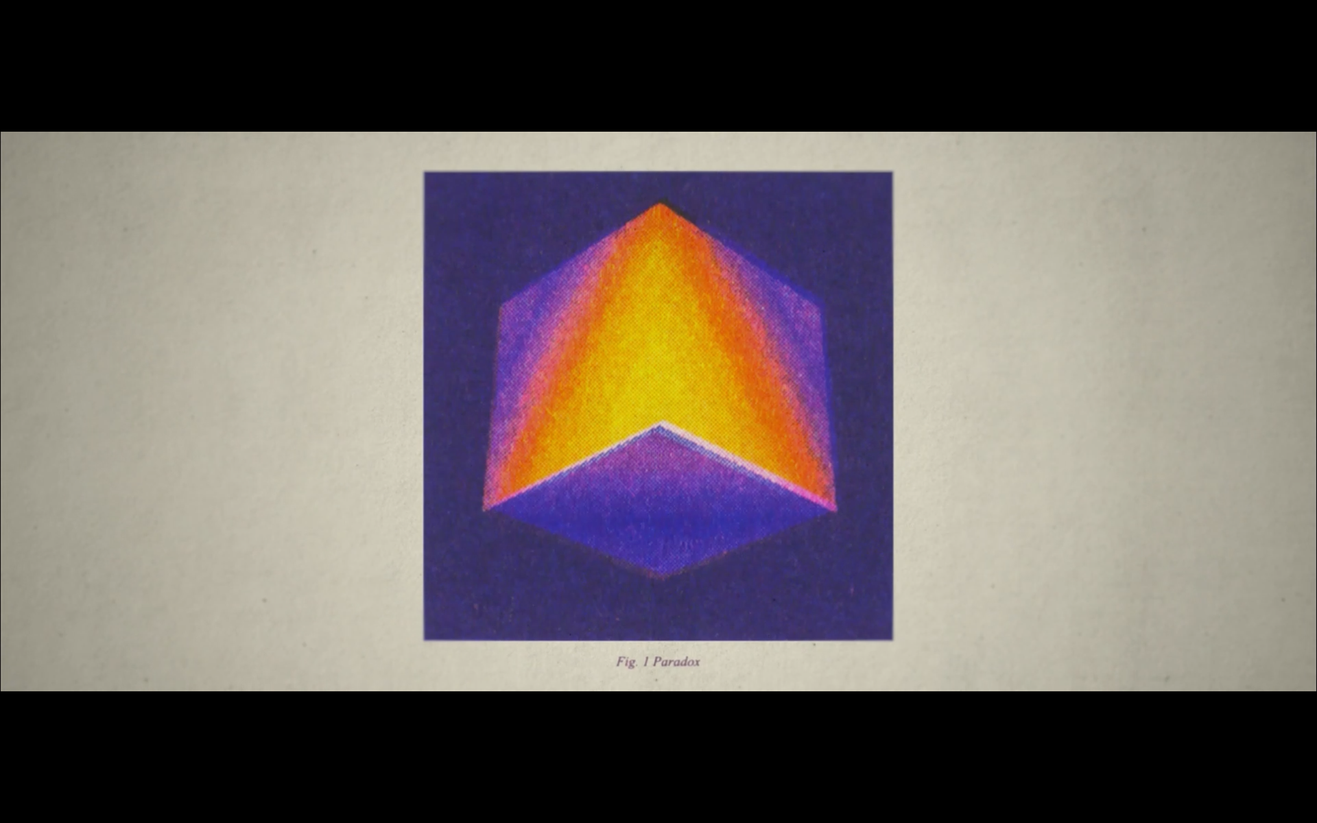
Fig. 1 Paradox

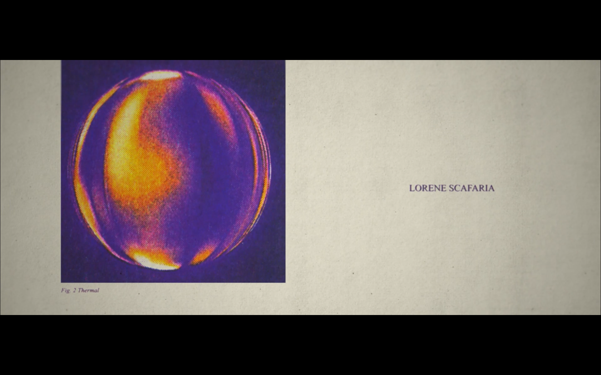
Fig. 2 Thermal

Fig. 3 Occurrence

Fig. 4 Quantum

Fig. 7 Wave

Fig. 8 Spin

Fig. 9 Multiverse

Fig. 10 Existence

Fig. 11 Distortion

Fig. 12 Reflection
STyle Frames
Coherence Title Sequence


